0098: More HeaderBar Stuff
Something else you can do with a HeaderBar is add an extra Button or three. Why? I’ll leave that to your imagination just as I’ll leave you to ponder why you’d wanna rearrange the contents of a HeaderBar as will be seen in our second demo today. For now, though, let’s concentrate on getting extra widgets in there. We’ll concern ourselves with rearranging stuff later.
HeaderBar Button
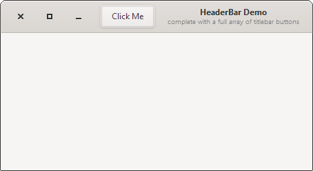
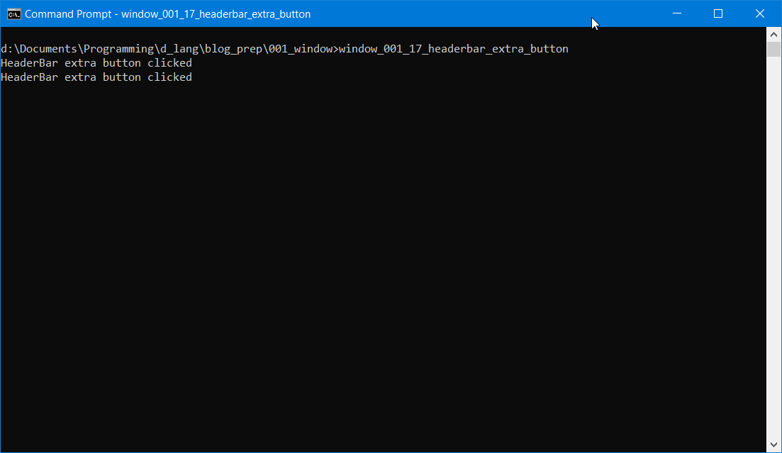
If we build on what we had last time, we can just add a statement to the preamble of our MyHeaderBar class:
HeaderBarButton headerBarButton;
And that gets instantiated and stuffed into our UI with these two statements in our constructor:
headerBarButton = new HeaderBarButton();
packStart(headerBarButton);
Take note that unlike Box.packStart() which takes four arguments, HeaderBar.packStart() only takes one, a pointer to the extra Widget you’re stuffing in there.
There’s only one thing left to look at for this demo and that’s the HeaderBarButton class:
class HeaderBarButton : Button
{
	string labelText = "Click Me";

	this()
	{
		super(labelText);

		addOnClicked(&onClicked);

	} // this()


	void onClicked(Button b)
	{
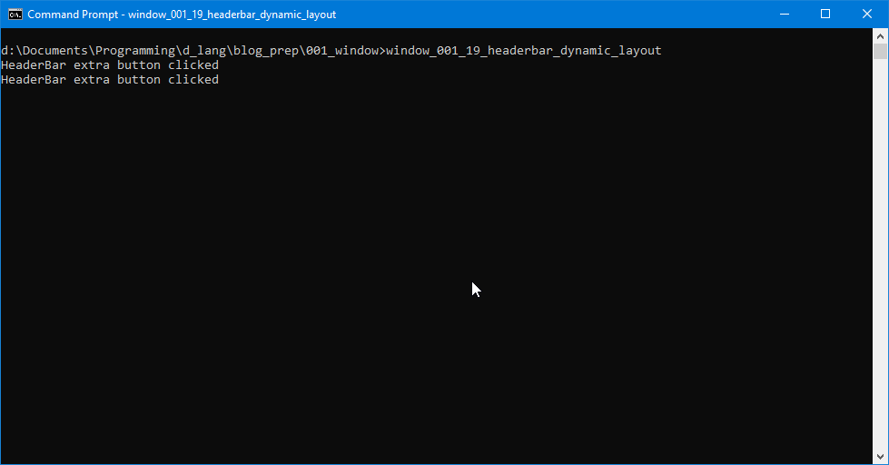
		writeln("HeaderBar extra button clicked");

	} // onClicked()

} // class HeaderBarButton
And as you can see, it’s just an ordinary Button dressed up for a night at the HeaderBar.
That gives us a Button to the left of the HeaderBar’s title and subtitle. But what if we want the Button to appear to the right instead?
Buttons to the Left of Title, Buttons to the Right
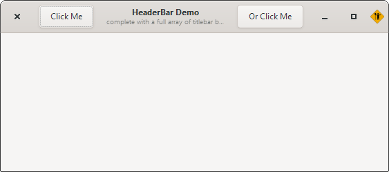
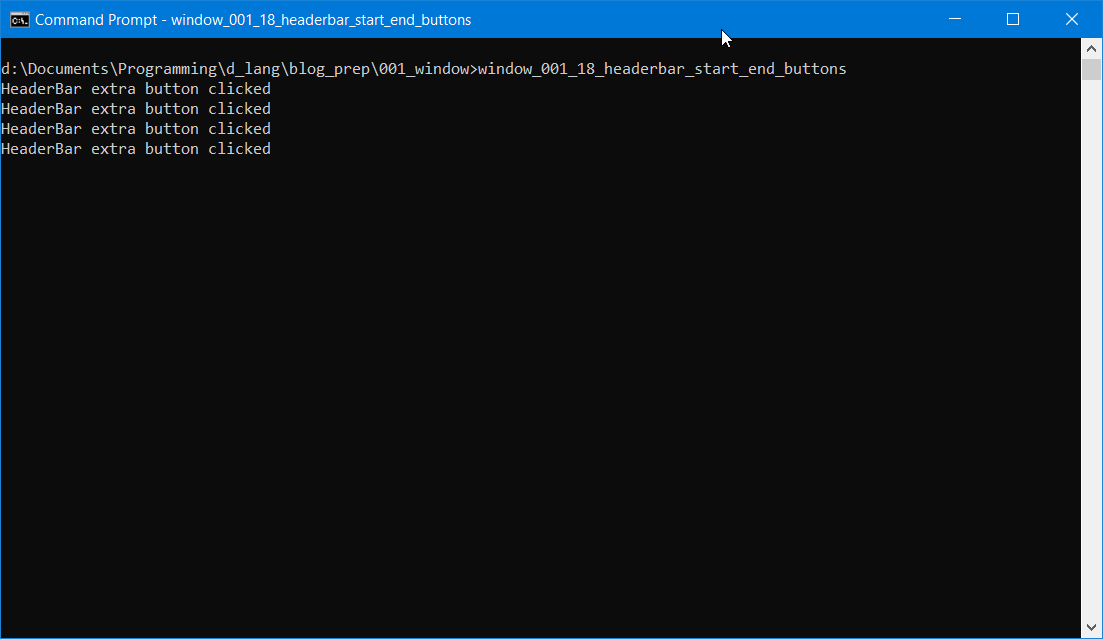
So, if packStart() will place a Button to the left of the HeaderBar’s title, what do you suppose packEnd() does?
headerBarButtonRight = new HeaderBarButton(rightLabel);
packEnd(headerBarButtonRight);
Yup, it sticks the Button after the Title/subtitle. And there’s nothing really exciting about that, but we’ve got a whole demo dedicated to it anyway.
Oh. And like HeaderBar.packStart(), HeaderBar.packEnd() only takes one argument.
But what if we need to have our standard Buttons move around under user control? Well, that’s covered, too… perhaps by accident, but maybe by design. Let’s have a look…
Dynamic HeaderBar Layout
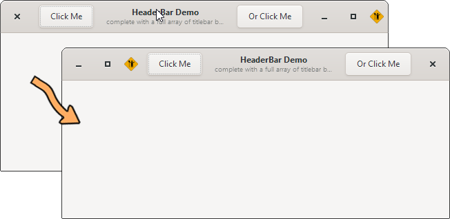
We won’t need to change any of the preamble or constructor code for this, just add a bit of functionality to our Button(s) like this:
class HeaderBarButton : Button
{
	string rightClose = "minimize,maximize,icon:close";
	string leftClose = "close:minimize,maximize,icon";
	HeaderBar _headerBar;

	this(string labelText, HeaderBar headerBar)
	{
		super(labelText);

		_headerBar = headerBar;

		addOnClicked(&onClicked);

	} // this()


	void onClicked(Button b)
	{
		writeln("HeaderBar extra button clicked");

		if(_headerBar.getDecorationLayout() == rightClose)
		{
			_headerBar.setDecorationLayout(leftClose);
		}
		else
		{
			_headerBar.setDecorationLayout(rightClose);
		}

	} // onClicked()

} // class HeaderBarButton
All we’re doing here is swapping the close, minimize, and maximize buttons from one side to the other. In the preamble, we layout the two button order strings:
string rightClose = "minimize,maximize,icon:close";
string leftClose = "close:minimize,maximize,icon";
And then in the onClicked() function, we check to see which one is in use and substitute the other.
A demo like this may seem a bit silly at first glance, but the implications—when added together with packStart() and packEnd()—can open up possibilities in UI hinting. Coupled with changes in HeaderBar text and/or background color, these elements can help orient the user to changes in configuration or status for whatever’s going on within a Window.
And just to round things out, let’s take a quick look at one more thing we can do with a HeaderBar, something you’ve likely guessed can be done, but let’s look at the proof…
An Image in a HeaderBar
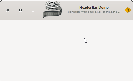
As mentioned earlier in this series, we aren’t restricted to using Button widgets in a HeaderBar, so why not an Image? It’s simpler than placing an image in a DrawingArea, in fact. All we have to do is add these lines to the constructor:
headerBarImage = new Image(imageName);
packStart(headerBarImage);
And don’t forget to do this at the top of your code:
import gtk.Image;
And add this to the HeaderBar preamble:
Image headerBarImage;
Conclusion
And that should give you an idea of how flexible the HeaderBar can be. When we come back to this topic, we’ll look at how they work with a Dialog. Until then, happy coding.
Comments? Questions? Observations?
Did we miss a tidbit of information that would make this post even more informative? Let's talk about it in the comments.
- come on over to the D Language Forum and look for one of the gtkDcoding announcement posts,
- drop by the GtkD Forum,
- follow the link below to email me, or
- go to the gtkDcoding Facebook page.
You can also subscribe via RSS so you won't miss anything. Thank you very much for dropping by.
© Copyright 2025 Ron Tarrant
