0079: Notebook III – Customized Tabs, Part I
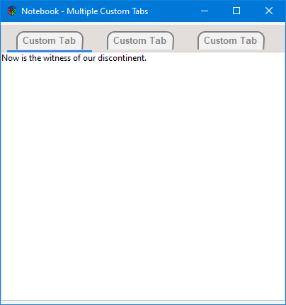
Here’s a screen-shot of what we’re up to:


Notebook tabs can be pretty much whatever you want. I read in one book that you could even, in theory, stuff an entire other Notebook inside a Notebook tab. We’re not going that far, but we will do some cool stuff.
But customized tabs can get tricky if you stuff anything into them besides a Label or Image widget. The reason it’s tricky? Because any widget that absorbs mouse clicks will stop the tab from responding to user input.

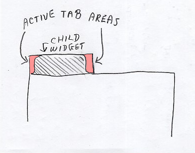
Okay, well… this isn’t 100% true. A label widget (notice, that’s label with a lowercase ‘l’) will not take up the full space allotted to a tab, so if your user clicks to the immediate left or right of the child widget, the result will still be as expected. But that’s not exactly the kind of thing you wanna be writing up in your docs, so we’re going to cook up a workaround. We’ll let the child widget react and harness that signal to trigger whatever would have been triggered by clicking directly on the tab.
Class Preamble for a Notebook with Customized Tabs
Our class starts off like this:
PositionType tabPosition = PositionType.TOP;
string tabLabelPrefix = "Custom Tab";

CustomTab customTab1, customTab2, customTab3;
MyTextView myTextview1, myTextview2, myTextview3;
string myTextView1Content = "Now is the witness of our discontinent.";
string myTextView2Content = "Four stores and seven pounds ago...";
string myTextView3Content = "Help me open yon cantelope.";
We’ve seen all this before. After the tab position variable, we have a prefix for label text (note: this isn’t Label text, just label text), content strings, and declarations for widgets we’ll be stuffing into the tabs.
The Notebook constructor–in fact, the rest of the Notebook class code—is almost the same as we’ve already worked with. The only thing that’s really different is the instantiation of the tab. Here’s what one of those looks like:
myTextview1 = new MyTextView(myTextView1Content);
customTab1 = new CustomTab(tabLabel1, 0, this);
appendPage(myTextview1, customTab1);
Instead of a Label, we’re instantiating a CustomTab object and we’re passing it three arguments:
- a string that will appear as the prefix in the customized tab label,
- a number to go with that prefix (so the tab’s name will be
CustomTab 0in this case), and - a pointer to the
Notebookitself to facilitate communication from the customized tab back to theNotebook. (This is part of the workaround I mentioned earlier.)
Moving right along…
A Signal & Callback for Switching Pages
One more thing that’s different in the Notebook constructor is this line:
addOnSwitchPage(&onSwitchPage);
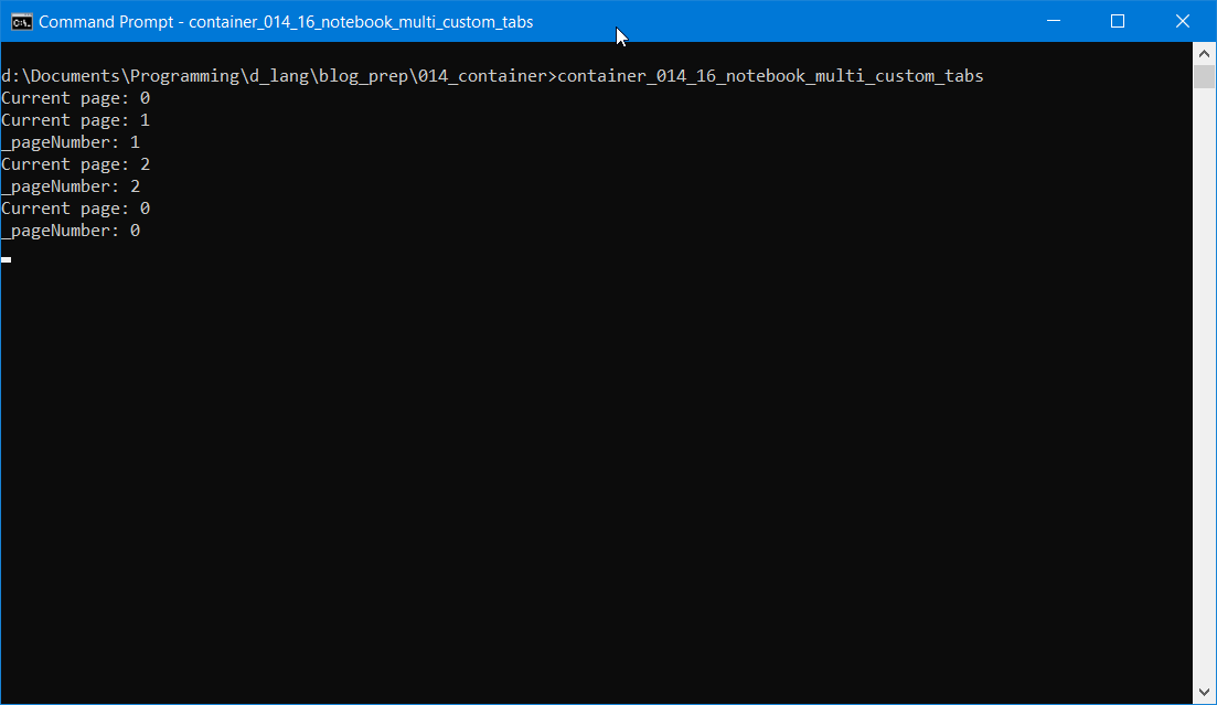
Here, we’re harnessing a signal that will trigger a callback every time the user clicks on a tab other than the one that’s current. And here’s the callback:
void onSwitchPage(Widget widget, uint pageNumber, Notebook notebook)
{
	_currentPage = pageNumber;

	writeln("Current page: ", _currentPage);

} // addOnChangeCurrentPage()
It’s straightforward. All it does is report which page is now current. But this callback will play an important part once everything’s hooked up and running because it’s the only way we have of knowing, programmatically, that the page has been switched. More about this later, too.
The Custom Tab Class
class CustomTab : Box
{
	TabDrawingArea tabDrawingArea;
	Notebook _notebook;

	this(string tabLabel, Notebook notebook, int tabIndex)
	{
		super(Orientation.HORIZONTAL, 0);
		tabDrawingArea = new TabDrawingArea(tabLabel, notebook, tabIndex);
		packStart(tabDrawingArea, true, true, 0);
		_notebook = notebook;
		showAll();

	} // this()

} // class CustomTab
This is just a Box. At the moment, we don’t really need this intermediary widget, but down the road, if we want to stuff more than one child widget into a tab, we will, so here it is.
All this does is serve to contain a DrawingArea… which it does quite well.
One thing I’ll point out here… this Box needs to make a call to showAll() so we get to see what’s in the Box. Without it, we’d be looking at a blank DrawingArea.
Conclusion
Over the next two blog posts, we’ll dig further into the customization code. Until next time, take care and may your inspiration always be inspired-ing-ly amazing.
Comments? Questions? Observations?
Did we miss a tidbit of information that would make this post even more informative? Let's talk about it in the comments.
- come on over to the D Language Forum and look for one of the gtkDcoding announcement posts,
- drop by the GtkD Forum,
- follow the link below to email me, or
- go to the gtkDcoding Facebook page.
You can also subscribe via RSS so you won't miss anything. Thank you very much for dropping by.
© Copyright 2025 Ron Tarrant
