0067: The Expander
Today’s widget example is similar to a TreeView with a TreeStore model, but with only two hierarchy levels, a parent with a single child. It’s also much simpler to use, but if we want to use it to its full potential, we’ll need to do more preparation, code-wise, but let’s start with the dead-simple version and go from there.
A Simple Expander


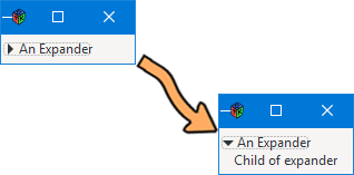
For those times when you need to hide/show things, but you don’t want the full-on features of a ComboBox or a TreeView backed by a TreeStore, the Expander may be just the ticket. And it does the job without all the overhead of either. You can simply stuff one into a container (such as an AppBox) like this:
class AppBox : Box
{
	bool expand = false, fill = false;
	uint globalPadding = 10, localPadding = 5;
	MyExpander expander;

	this()
	{
		super(Orientation.VERTICAL, globalPadding);

		expander = new MyExpander();
		packStart(expander, expand, fill, localPadding);

	} // this()

} // class AppBox
Now you’ll notice I’m not using a bare-bones Expander, but all I’ve done is follow the convention I laid out for these blog examples and derive MyExpander from Expander so as to keep all the details in an easily-managed class/object… like this:
class MyExpander : Expander
{
	string label = "An Expander";
	bool isMnemonic = false;
	Label childLabel;

	this()
	{
		super(label, isMnemonic);

		childLabel = new Label("Child of expander");
		add(childLabel);

	} // this()

} // class MyExpander
The Expander is derived from the Bin widget which means working with add() and remove() to stuff things in and—if necessary—yank them out.
The only thing we haven’t seen before is the call to the Expander constructor whose arguments are:
label– the child you want to reveal when theExpanderis expanded, andisMnemonic– a Boolean that controls whether or not the user can hit an Alt+key combination to expand/contract theExpander.
Can’t get much simpler than that, but you can get more complicated if you want to reveal more than a single widget when the child container is visible.
A Note about the getExpanded() Function
Naturally, if you want to trigger a callback, you’ll be working with the onActivate signal, but like any engineer will say about the flow of electricity in the real world: it works the opposite of what you may expect.
Hooking up the signal is the same as always, but polling getExpanded() to find the Expander’s state means the callback will need to be written like this:
	void doSomething(Expander expander)
	{
		writeln("Expander was clicked and...");

		if(getExpanded == false)
		{
			writeln("Expander is expanded, child revealed.");
		}
		else
		{
			writeln("Expander child is now hidden.");
		}

	} // doSomething()
Intuitively you might think expanded means the Expander is… well, expanded, but it doesn’t. I don’t know if there’s a reason for this, but if I find out there is one, I’ll let you know.
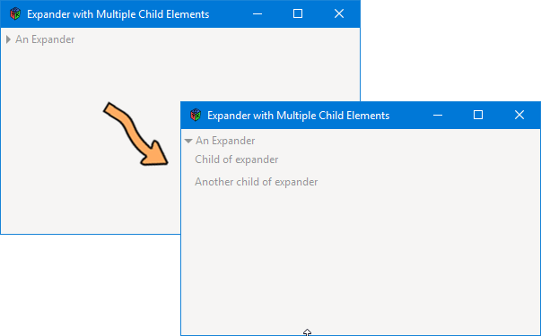
A More Crowded Expander


To stuff more widgets into an Expander’s child area, I opted for the Grid as a container. Stick a Grid in there and follow the guidelines I laid out in the post covering customized Dialog windows and you should have no trouble getting a decent layout happening.
Here’s the derived Grid I used (it’s based on the PadGrid from the custom Dialog example):
class ExpanderChildGrid : Grid
{
	int leftStartColumn = 0, topStartRow = 0, extendToRight = 1, extendToDown = 1;
	int borderWidth = 10;
	uint globalPadding = 0, localPadding = 0;
	PadLabel childLabel01, childLabel02;
	BoxJustify bJustify = BoxJustify.LEFT;
	string labelText01 = "Child of expander", labelText02 = "Another child of expander";

	this()
	{
		super();

		childLabel01 = new PadLabel(bJustify, labelText01);
		attach(childLabel01, leftStartColumn, topStartRow, extendToRight, extendToDown);

		childLabel02 = new PadLabel(bJustify, labelText02);
		attach(childLabel02, leftStartColumn, topStartRow + 1, extendToRight, extendToDown);

		setMarginLeft(10);

	} // this()

} // class ExpanderChildGrid
When I borrowed this piece of code, the other thing I changed was that ‘pJustify’ became ‘bJustify’ because it makes more sense… considering that it’s a BoxJustify variable. (I don’t remember why I originally called it ‘pJustify,’ but likely because I first called it ‘PadJustify’. Not important, but there it is.)
If you also grab the PadLabel and HPadBox classes from the custom Dialog example, along with the BoxJustify enum, you’ll be all set to cram whatever you want into the Expander’s child Bin.
Conclusion
And there you have it, yet another way to hide child widgets inside a parent widget, this one seemingly with one foot in the ComboBox camp and the other in the TreeView/TreeStore camp and yet, easier to use than either.
Hope you found this as revealing as I did (no pun intended… honest). Until next time.
Comments? Questions? Observations?
Did we miss a tidbit of information that would make this post even more informative? Let's talk about it in the comments.
- come on over to the D Language Forum and look for one of the gtkDcoding announcement posts,
- drop by the GtkD Forum,
- follow the link below to email me, or
- go to the gtkDcoding Facebook page.
You can also subscribe via RSS so you won't miss anything. Thank you very much for dropping by.
© Copyright 2025 Ron Tarrant
